Logotype
Logotype
TÉLÉCHARGEMENT
The logotype is the most important element in our visual identity and should be handled with care. Our logotype is a wordmark and exists in 2 versions, black and white. Which version to use depends on context, technical circumstances, different backgrounds and contrast vary.


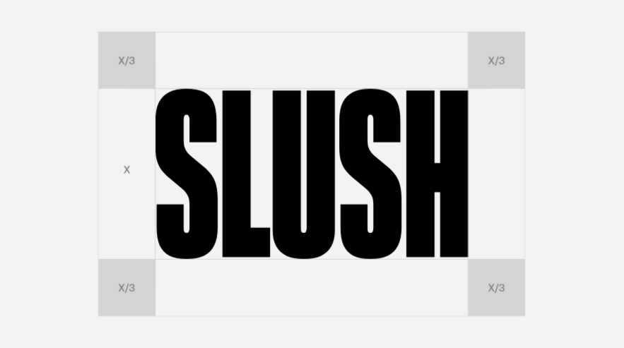
Clearspace
The clearspace is the space surrounding the logotype that assures its integrity. Within this space it is not allowed to place text, symbols or other elements. Maintain a clear area around it, equal to at least 1/3 of the logo’s height.
Symbol
TÉLÉCHARGEMENT
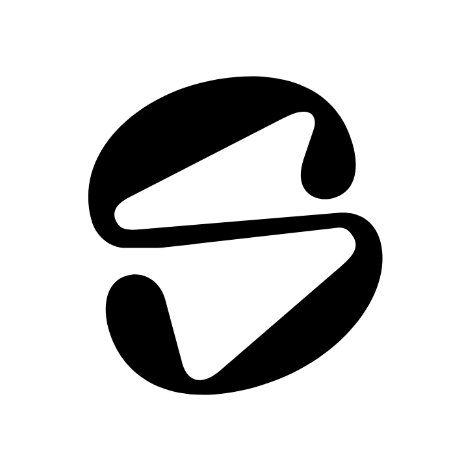
The Slush symbol is the core visual representation of Slush. The symbol is an abstraction of a S, our initial letter.


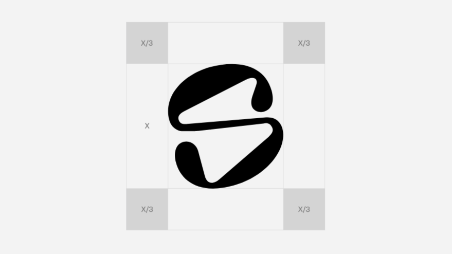
Clearspace Symbol
The clearspace ensures symbol legibility and impact by isolating it from competing visual elements, such as body text or supporting graphics.
3D Logo
In addition to our primary flat logo, we have a secondary option that introduces a three-dimensional, slushy texture. This version emphasizes the playful and refreshing nature of our brand, bringing the essence of “slush” to life in a more tactile and immersive way.
 logo 3D bleu
  logo 3D violet